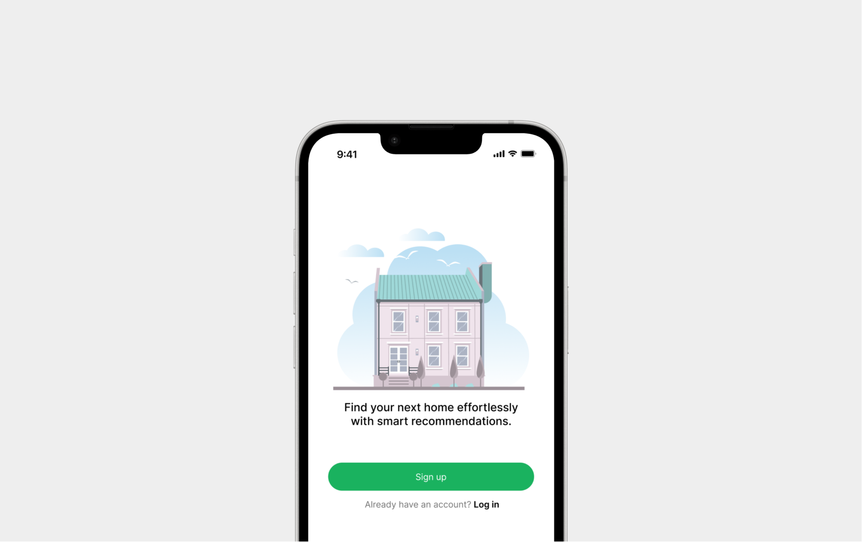
Product thesis
Rental apps translate desire — "a bright place, close to work" — into checkboxes. And return the same generic list to completely different profiles.
Dwello flips the logic: it learns from behavior, anticipates with proactive notifications, and delivers an explainable Match Score that restores confidence in the decision.
What competitors get wrong
Filters become a chore. Search becomes fatigue. Decisions get postponed.
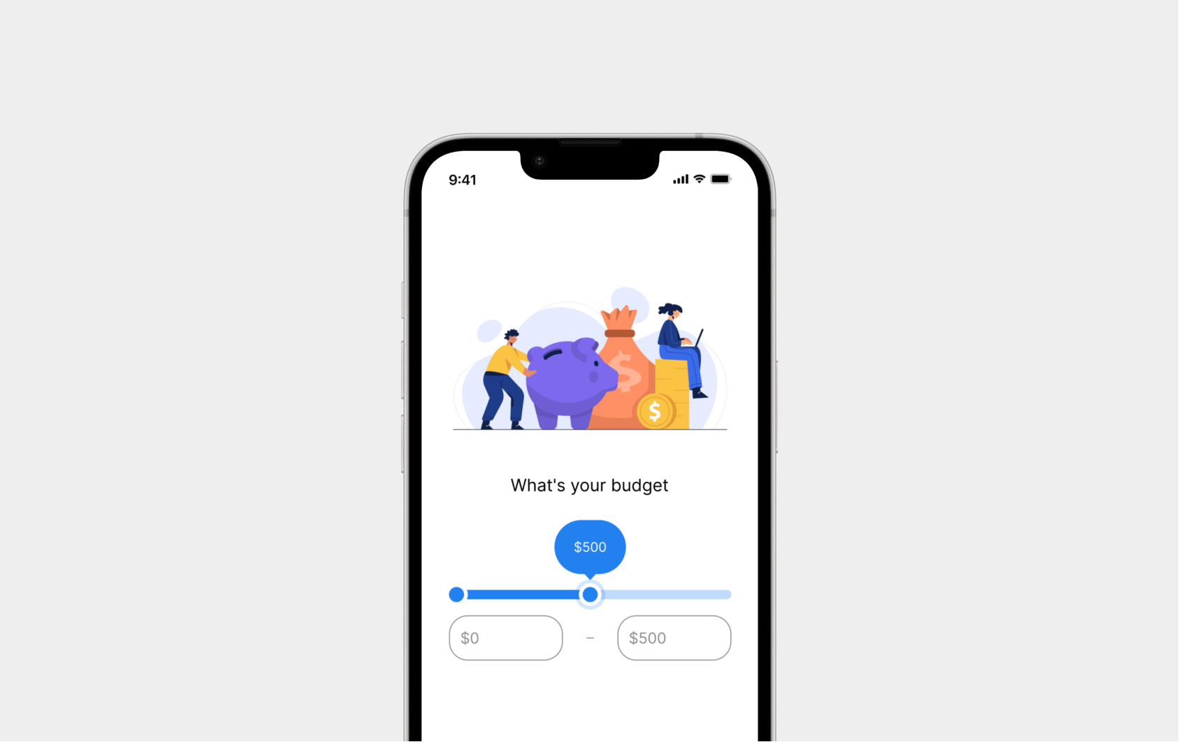
- Wrong language. Users think in lifestyle; the app asks for square footage.
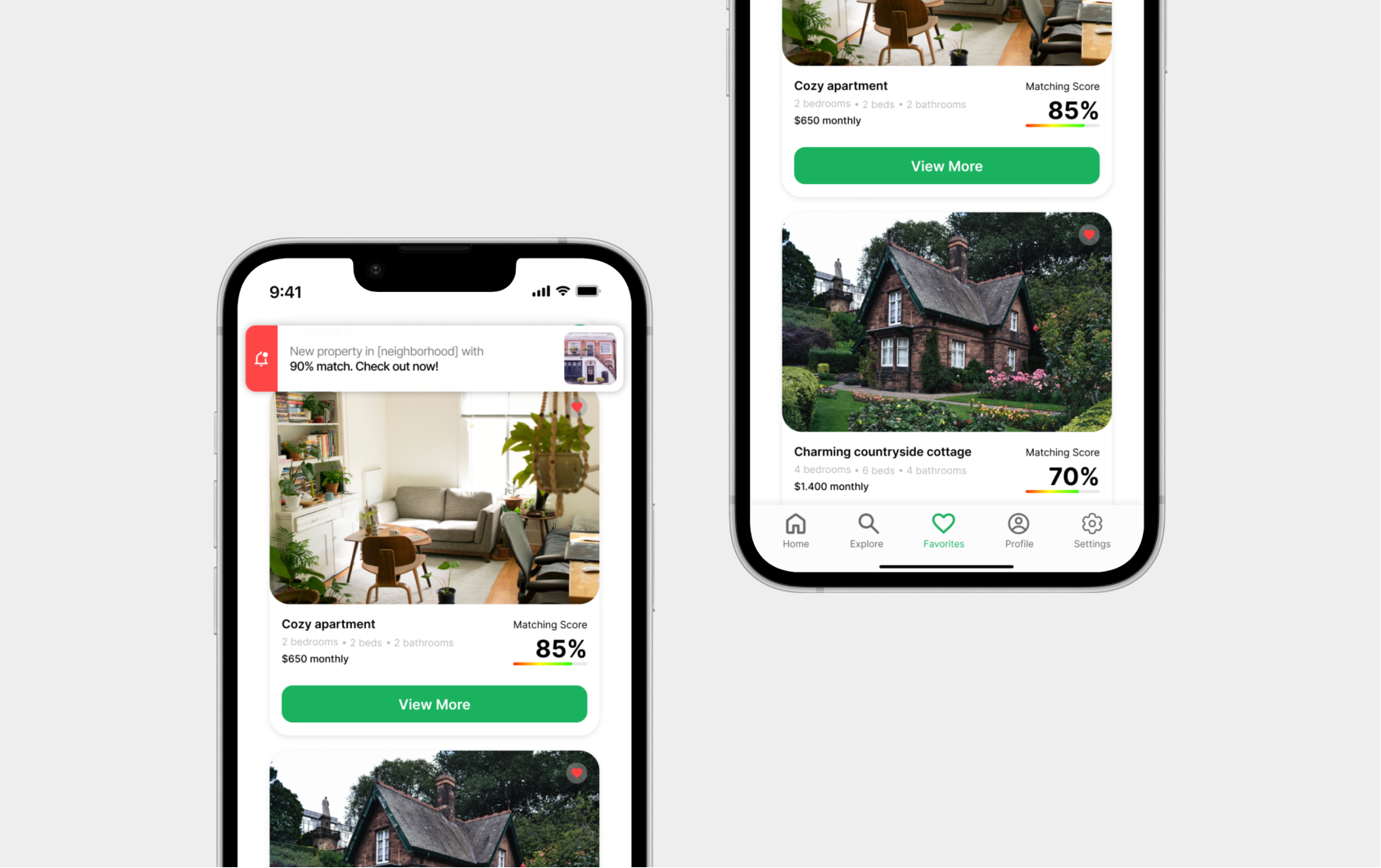
- Passive discovery. Without relevant alerts, the app depends on daily opens.
- Generic results. Different profiles get the same list.
Method
From hypothesis to test, decisions anchored in evidence — not preference.
Qualitative research
Semi-structured interviews + journey maps. The focus was mapping emotional friction, not stated preferences.
Own design system
Lo-fi → hi-fi in Figma. Palette, typography and components with states — foundation to scale visual decisions without rework.
Usability testing
Think-aloud with focus group. Completion rates and time-on-task drove iteration — not opinion.
Four pillars
Each mechanism addresses a pain mapped in research.
Trade-offs
- Clean × info-rich. Solved with progressive hierarchy — specs only when relevant.
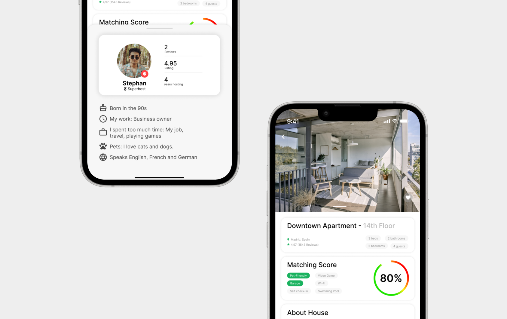
- Simple × explainable score. Chose number + visible rationale: trust > elegance.
- Cold start. Guided onboarding + contextual fallback offsets models with no history.
What I carry forward
- Users don't want more filters — they want fewer bad decisions.
- Transparency > precision: 85% explained beats 95% black box.
- Cold start is a design problem, not just engineering.
What testing surfaced
Projected outcomes- Match Score was the most praised feature — clarity and decision support.
- Notification system significantly improved re-engagement.
- Users described the experience as "guided" instead of "solitary."